CONTEXT
Yuchi Toast is a neighbourhood breakfast shop located near a university. After nearly a decade in business, the brand needed a refreshed identity that could connect with a new generation of customers without losing its familiar, everyday character. The new system gives Yuchi Toast a clearer and more cohesive presence across packaging, menus and the physical shop environment.
CREATIVE DIRECTION
Turning Everyday Familiarity into Morning Energy
Yuchi Toast brings together the comfort of a familiar neighbourhood breakfast and the energy of starting a new day. From students heading to school to office workers beginning their morning commute, the identity connects these everyday routines through warm, recognisable forms and a playful visual language.

Defining the Direction
The visual direction was defined across three dimensions, balancing the familiarity of a neighbourhood breakfast shop with a fresh and distinctive character.
Playful
Refined
Organic
Geometric
Traditional
Modern
Keywords
Playful · Satisfying · Energetic
Moodboard
Exploring familiar breakfast moments through bold forms, bright colour and a visual rhythm that brings energy to the start of the day.


Identity system
A satisfying bite, made into a mark
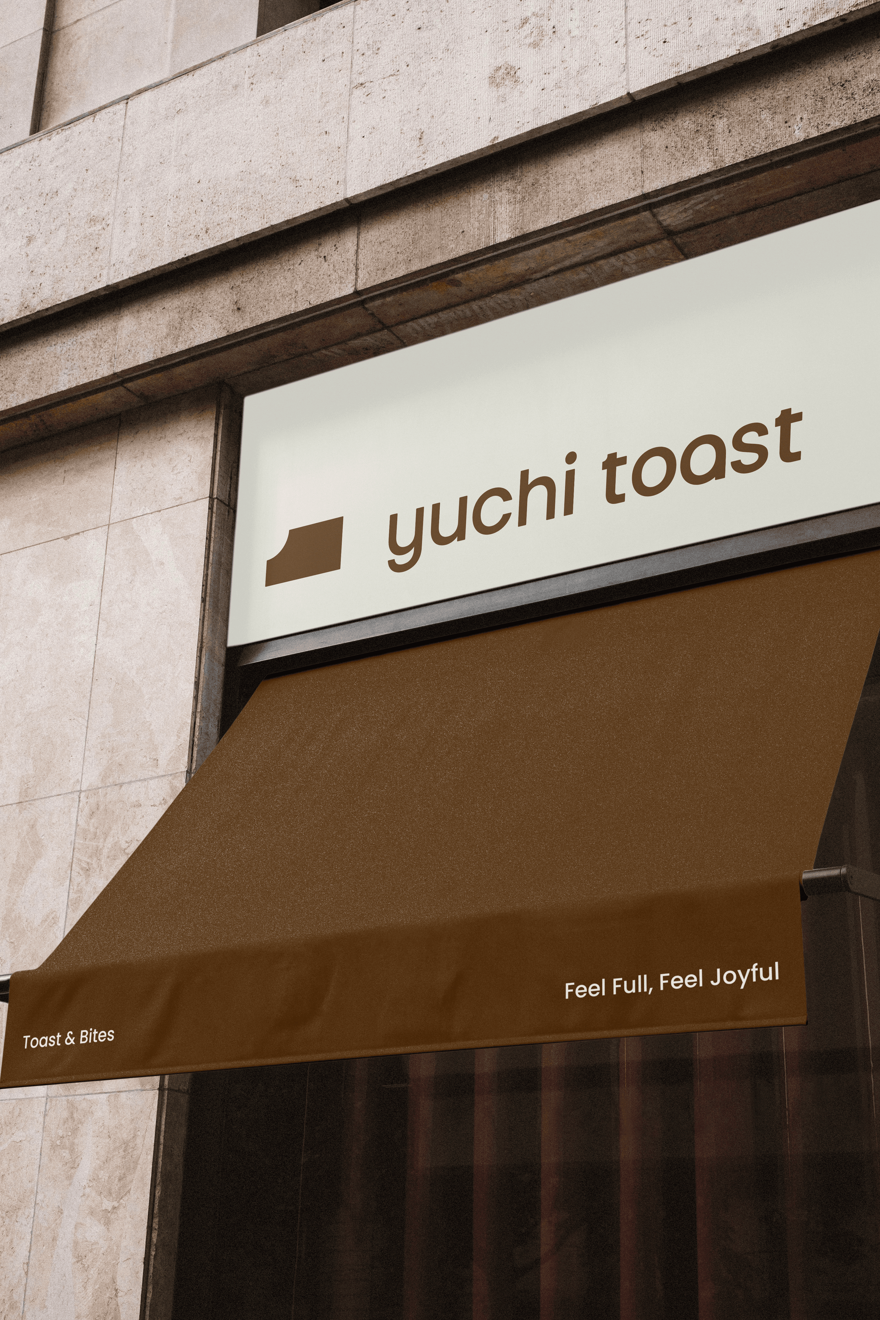
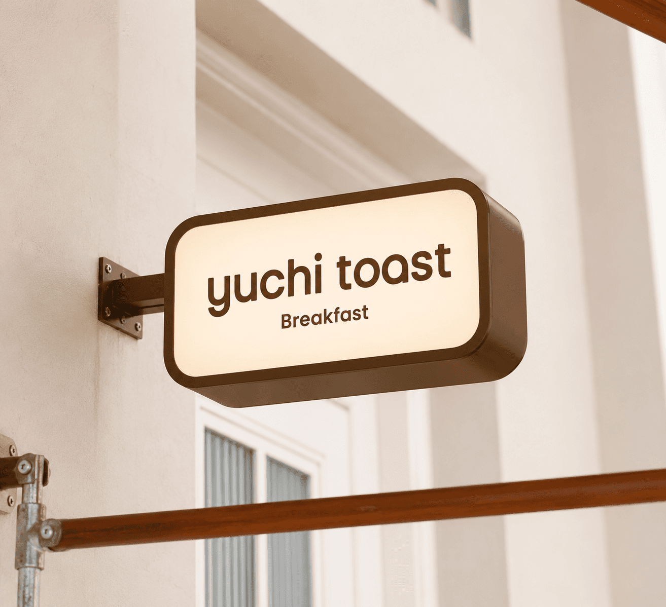
The identity begins with an abstract toast symbol shaped around the curve of the letter “t.” Its bitten corner captures a small moment of satisfaction, while the solid geometric form conveys fullness and substance. Paired with a rounded wordmark, the mark creates an identity that feels both familiar and distinctive.


Colour Palette
Inspired by the warmth and variety of breakfast, the palette combines brown and cream with bright blue, yellow, orange and green. Together, the colours create a flexible system that feels welcoming, playful and full of energy.

Graphic Element
A breakfast system built to mix ——
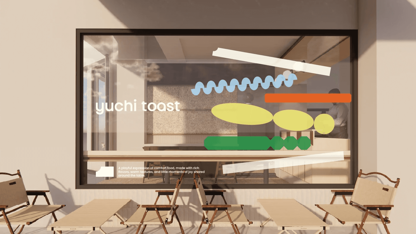
Familiar breakfast ingredients are reduced into simple geometric shapes that can be combined, layered and rearranged across different formats. The system brings variety and rhythm to each application while keeping the overall identity clear and recognisable.


Application