CONTEXT
An identity built for growth
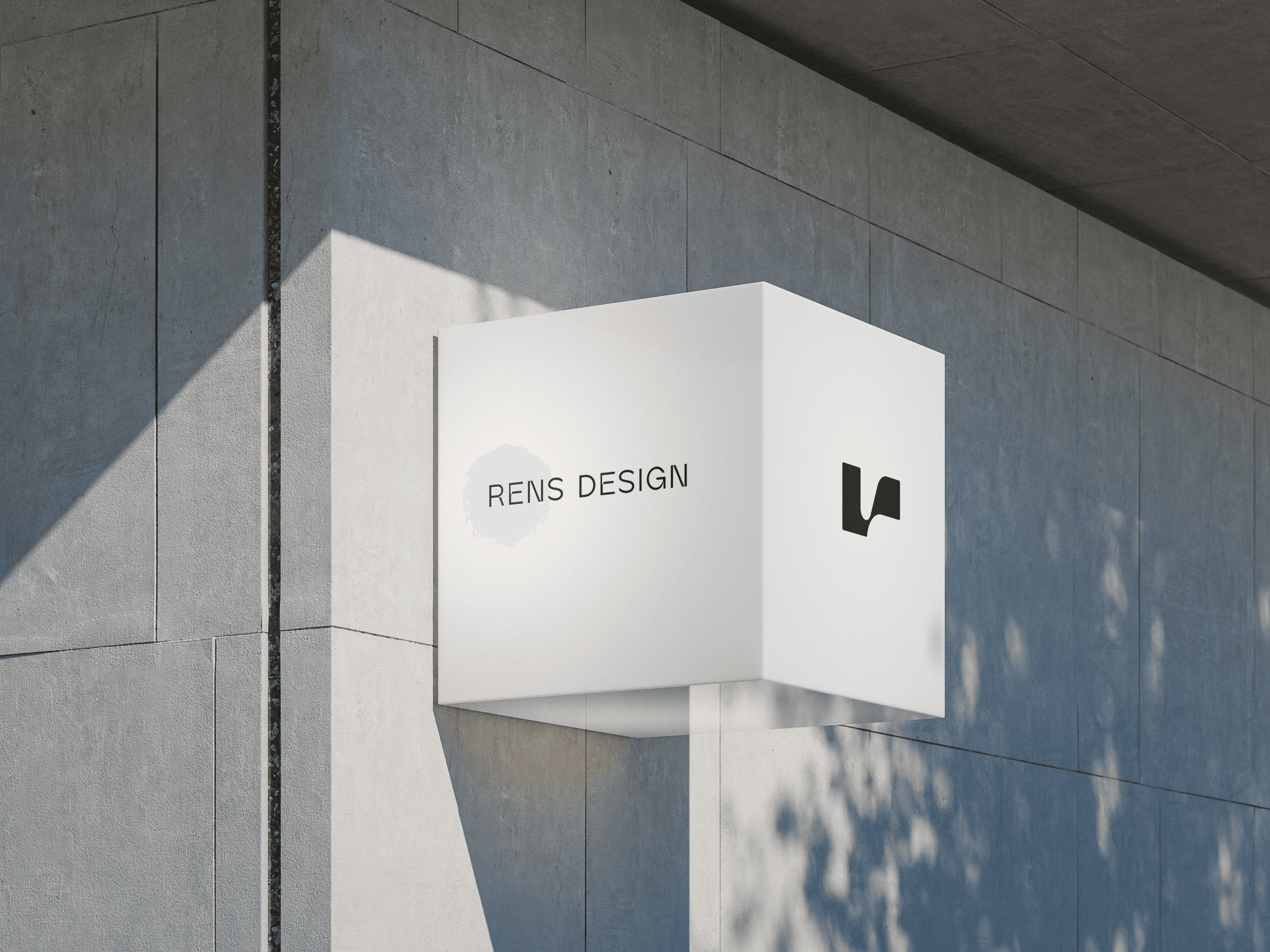
Rens Design is an interior design studio working across residential, commercial and workplace spaces. After five years of practice with only a temporary logo, the studio had outgrown its existing identity. As its scope expanded, Rens needed a clearer and more cohesive system—one that could reflect its approach to space and support the studio’s next stage of growth.
CREATIVE DIRECTION
Shaping everyday life between structure and atmosphere
Rens balances architectural precision with the atmosphere of everyday life. The identity brings these qualities together through structured forms, fluid transitions and a composed visual rhythm.

Defining the Direction
The visual direction was defined across three dimensions, balancing clarity and structure with a considered and expressive character.
Emotional
Rational
Organic
Geometric
Minimal
Maximal
Keywords
Structured · Fluid · Extended
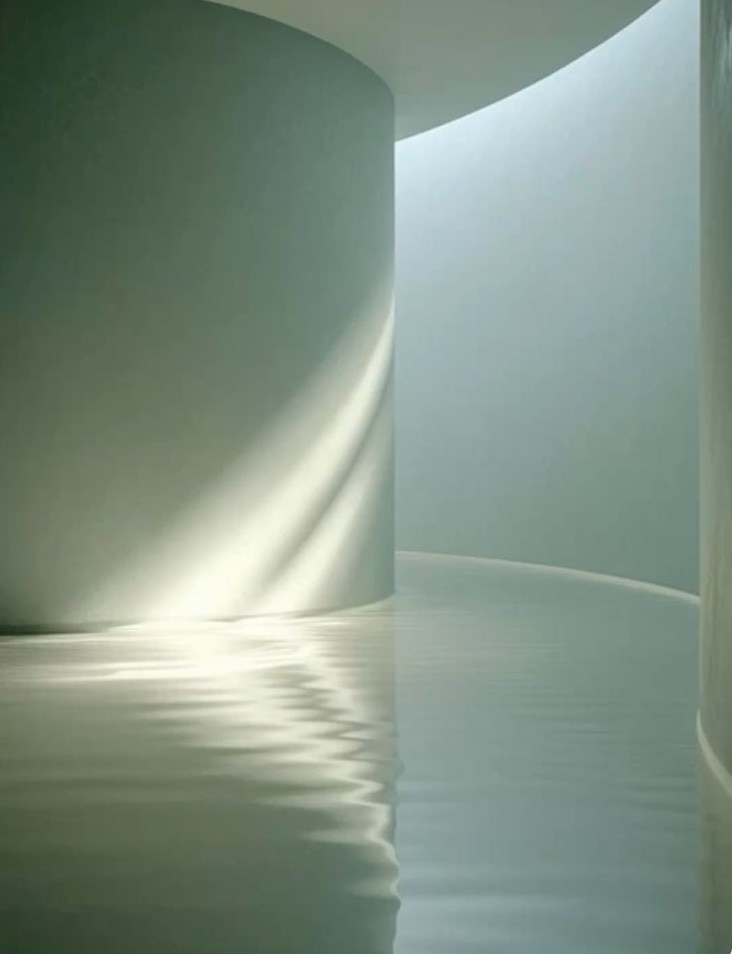
Moodboard
Exploring spatial structure, fluid form and rhythm as the foundation of the visual language.


Identity system
Logotype
A rational mark with a softer edge
The identity begins with a precise wordmark, softened by a single fluid curve where its forms meet. This gesture extends into an abstract “r” symbol, creating a distinctive signature that balances architectural order with a more human character.


Colour Palette
Drawn from the materials and atmosphere of the Rens studio, the palette combines architectural neutrals with warmer accents, connecting the identity directly to the spaces the practice creates.


Graphic Element
A system designed to move ——
The curve of the mark expands into a modular graphic system. Lines and forms can be rearranged and extended across different formats, creating consistency without becoming rigid.

Application